Ritegeo Systems
Brief: With a strong design team, extensive manufacturing facilities, past experience, and proven expertise, Rite Geosystems provide complete monitoring services to their client’s satisfaction. The company provides online geotechnical, structural, geodetic, and environmental monitoring solutions via cloud platforms as well as in-house servers. A unit of the renowned Encardio-rite Group, Rite Geosystems leads the group’s operations across the world in the USA, Europe, and Asia.
In view of this, the brand wanted to be projected as a reliable, and superlative organization that can take forward all infrastructure requirements with ease.
Concept: As a first step approach our organizing ideas focused on the theme of ‘Seeing the potential and delivering value’ to reflect their distinctive service approach. As the brand had been a long-established name in the industry, we wanted this aspect to shine through in all its glory. As a part of our ‘creative’ and ‘entrepreneurial’ strategy, we aspired to characterize how different Rite Geosystems are and how we emote their ethos into all their corporate communication mediums, be it the website, brand identity, typography, and the color theory.
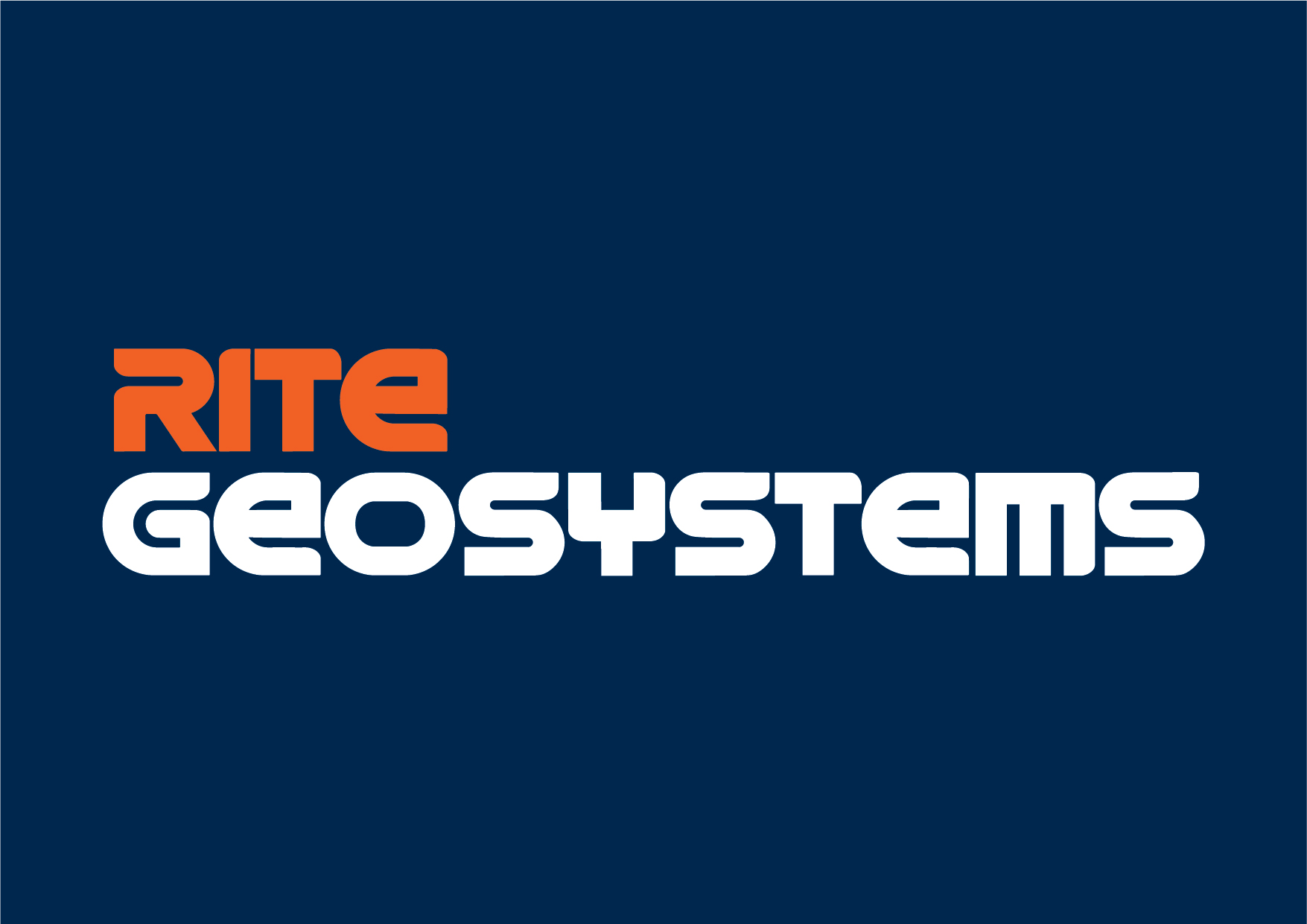
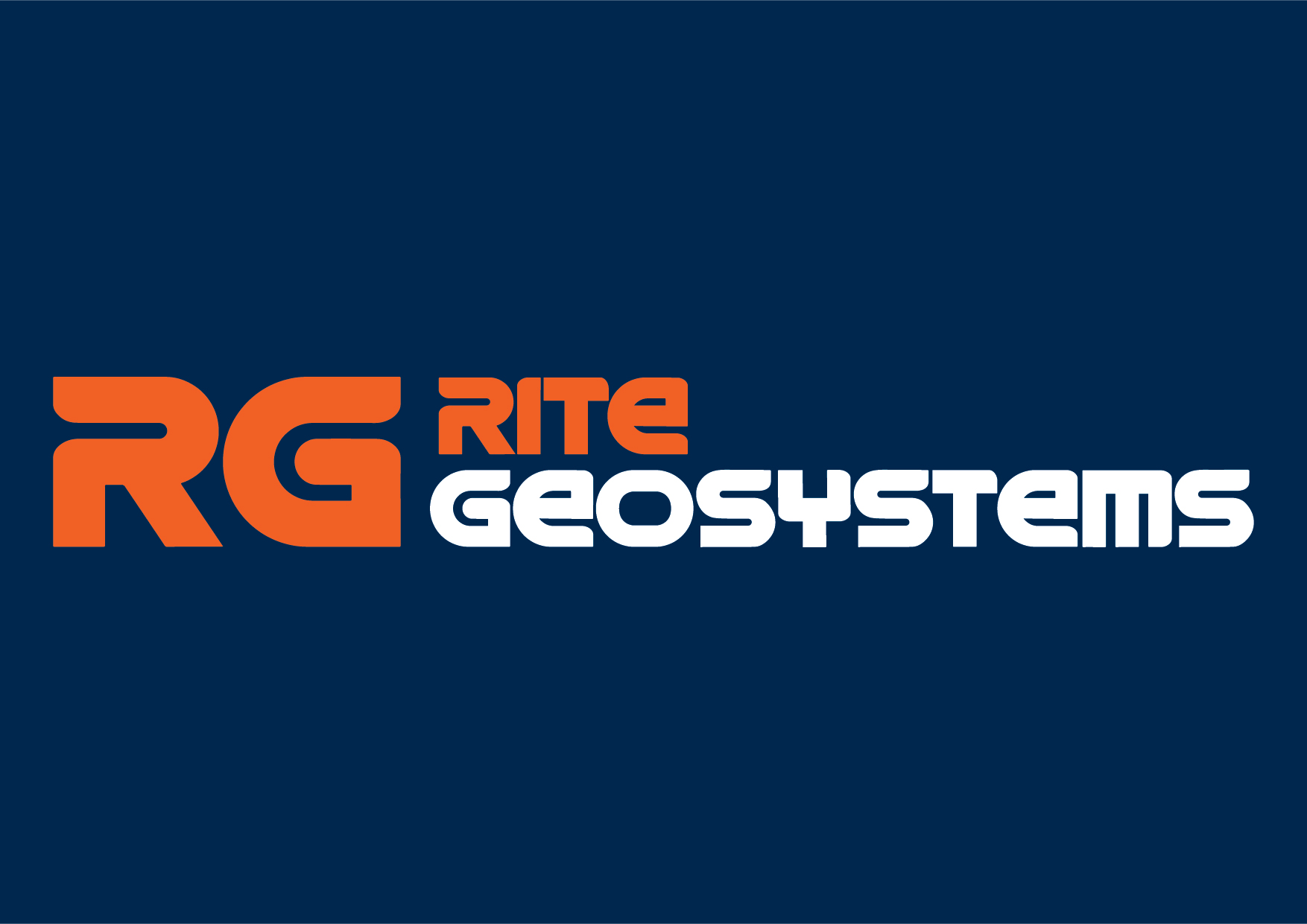
Agency Role: We explored and analyzed the playing field first. With offices across major business locations in the world, the brand wanted to be represented as an ideal choice for quality infrastructure development. Initially known as Encardio-rite, we renamed it Rite Geosystems to inspire a universal connection. The look and feel we wanted to depict for them was more global and cosmopolitan in nature, one that showcased them as an organization of the world, that is advanced, modern and one that forges ahead with changing times.
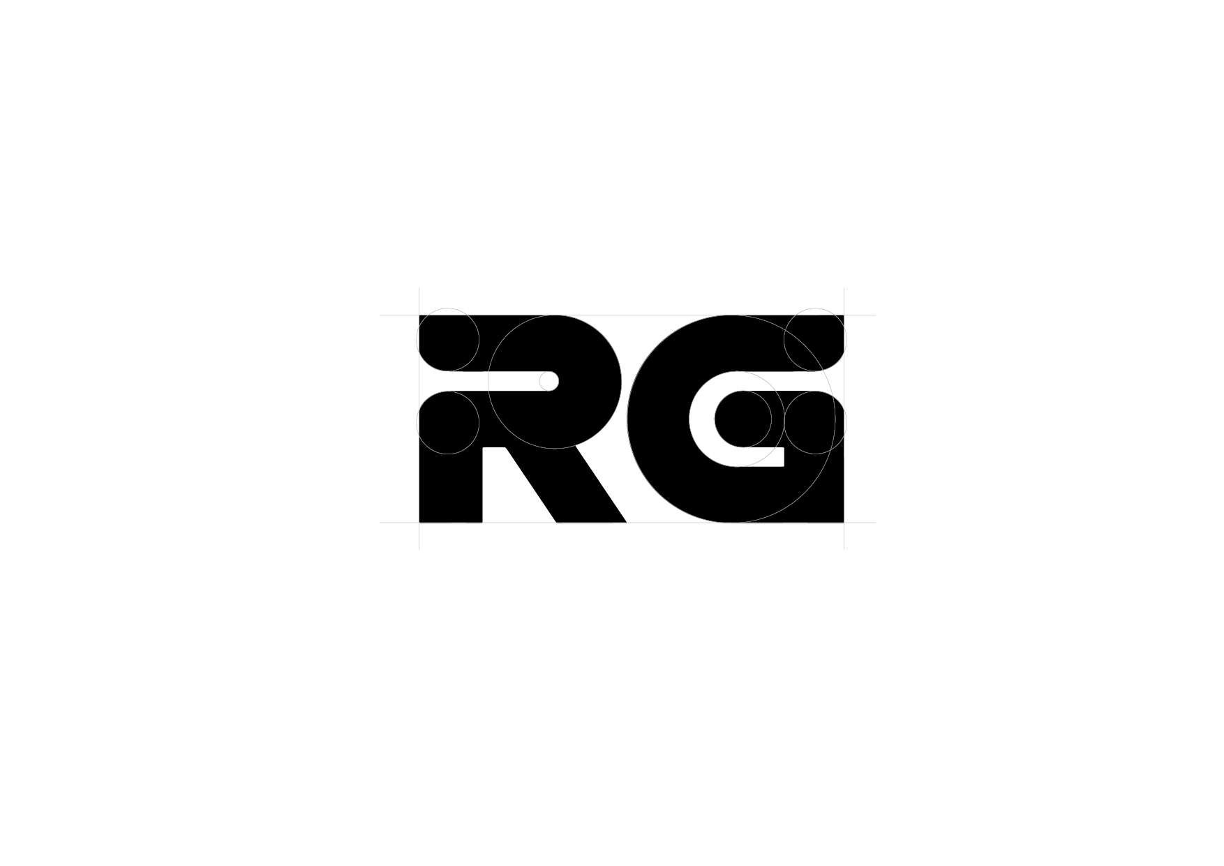
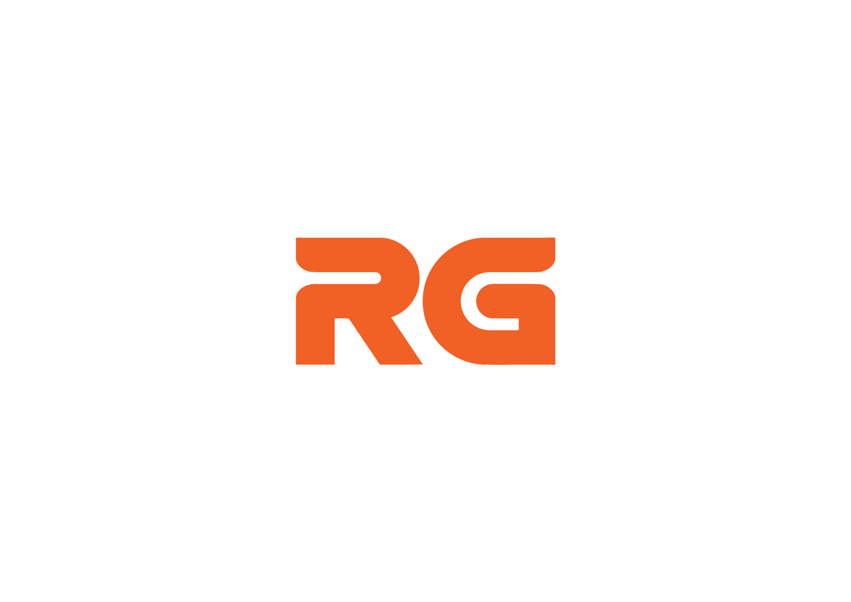
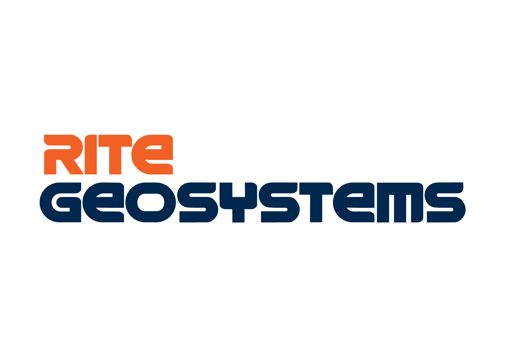
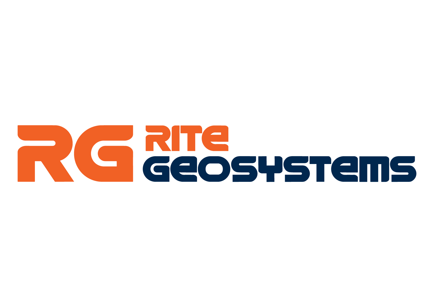
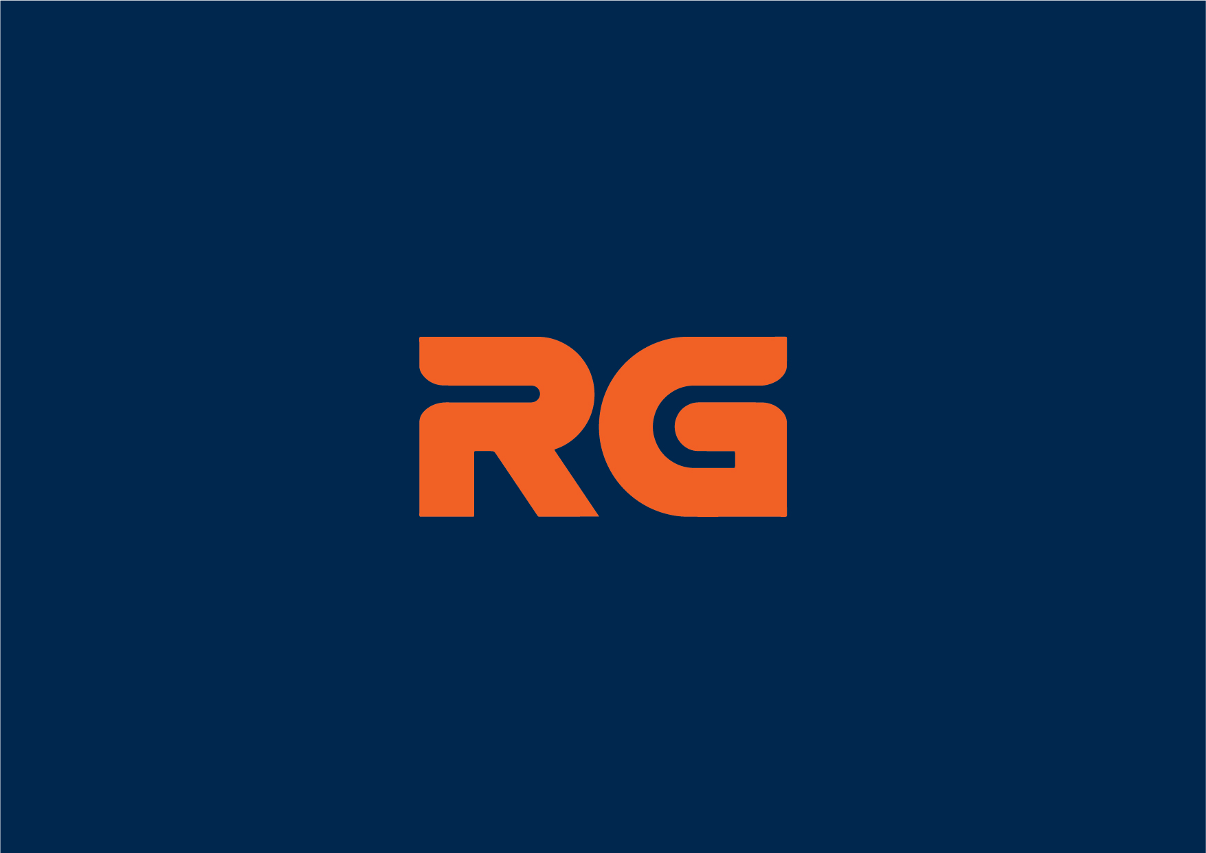
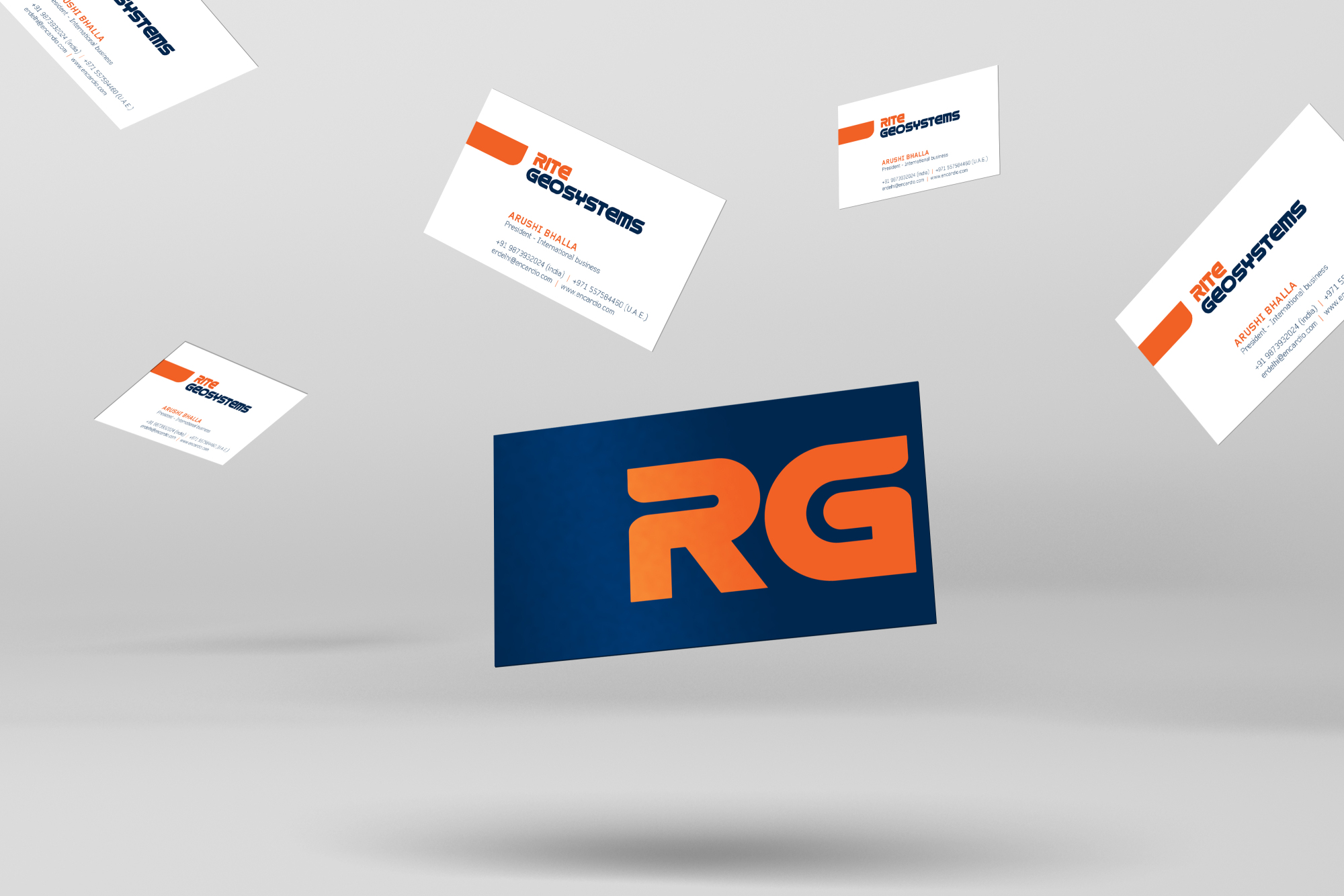
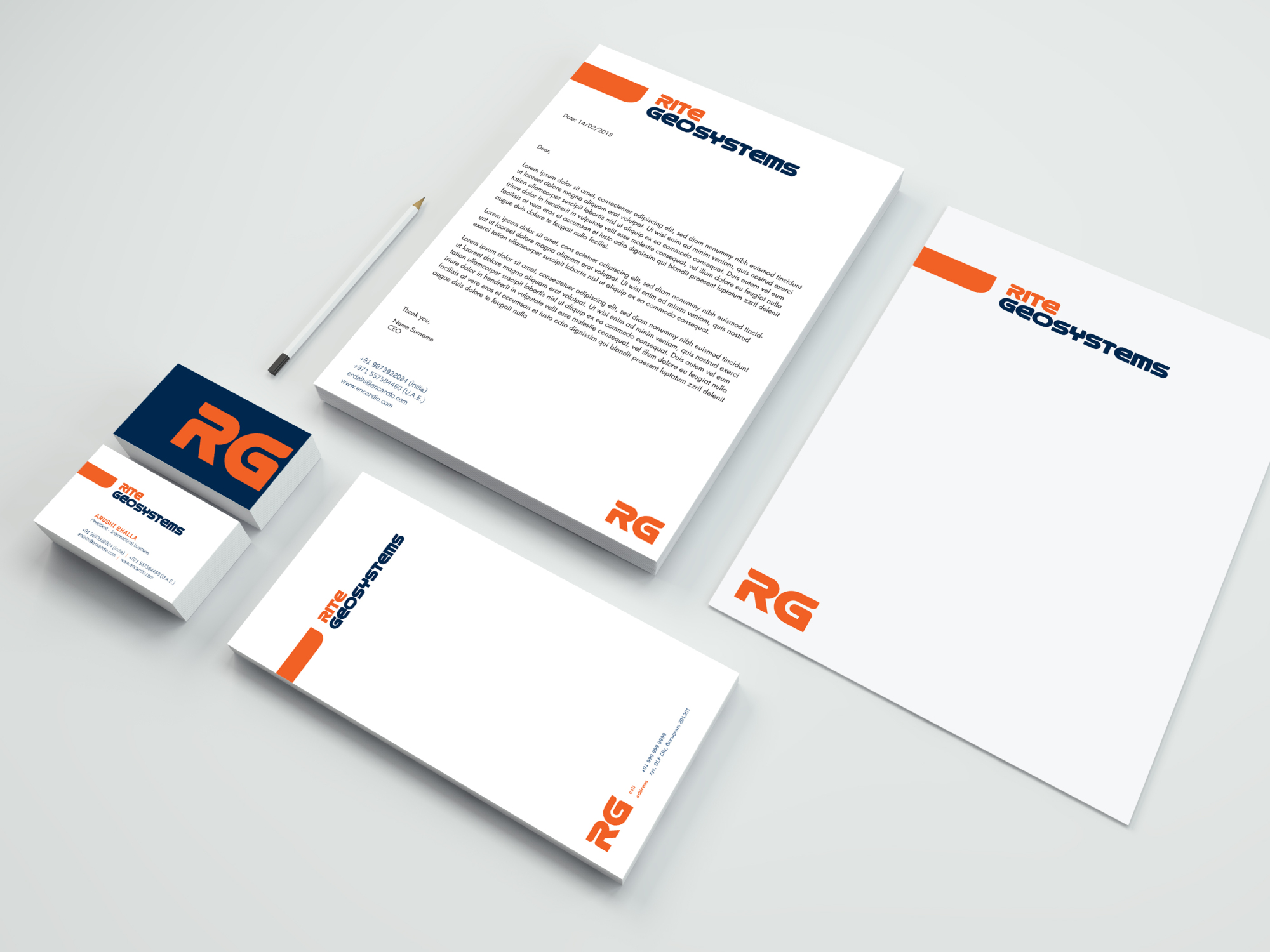
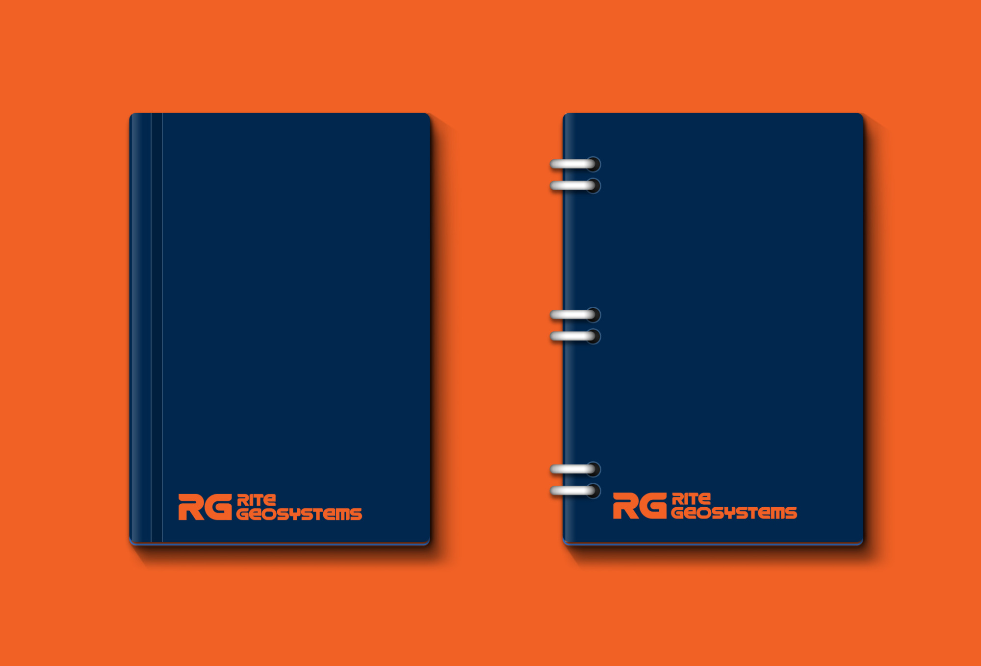
With the ethos of a well-grounded and dependable organization that delivers prime infrastructure results, we wanted the logo to emote this drive too. Herein, we chose the right set of colors and created a customized typeface keeping in mind their vision and values. The logotype was specifically designed for the brand that amalgamated a bold and strong visual identity.
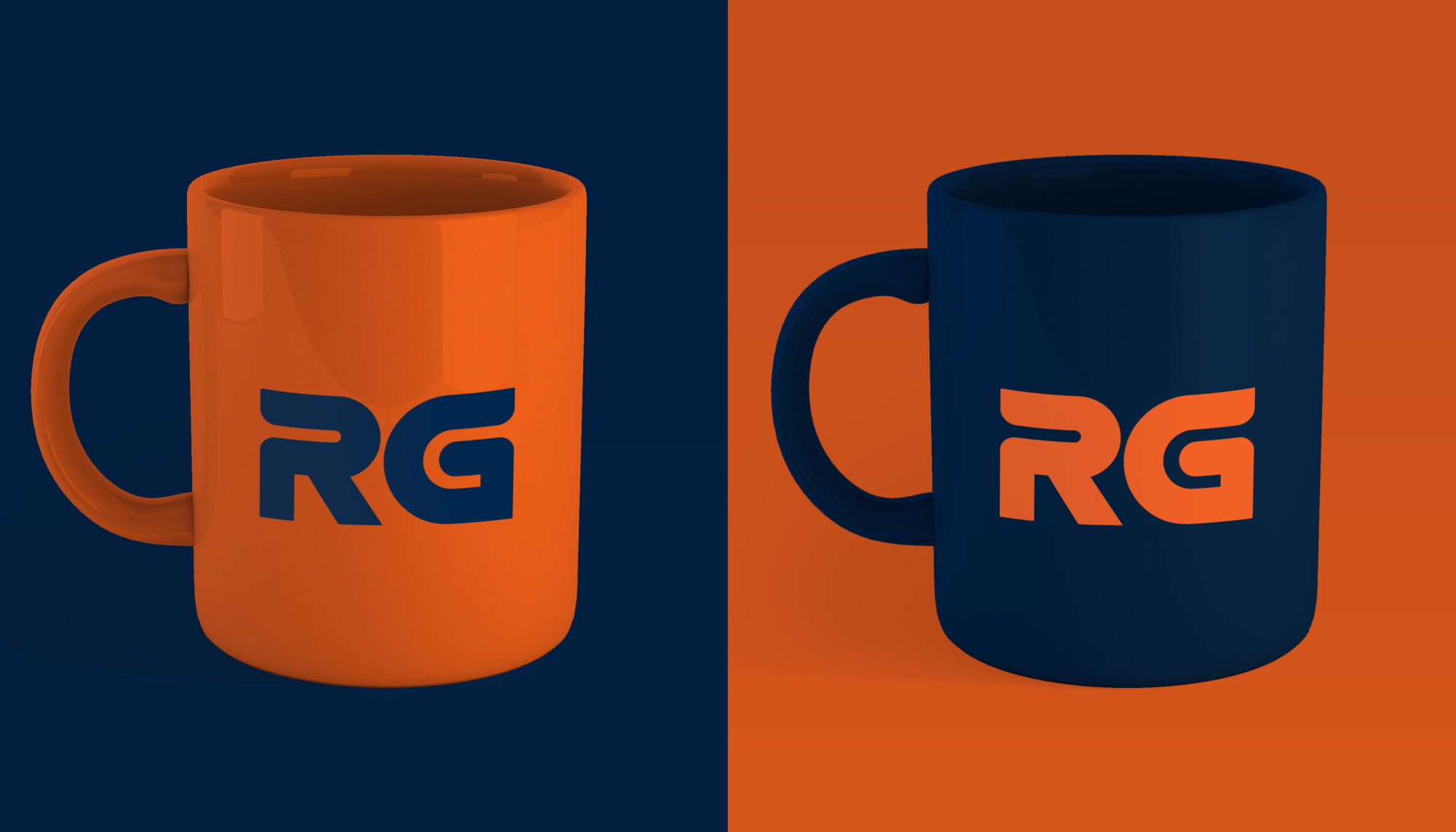
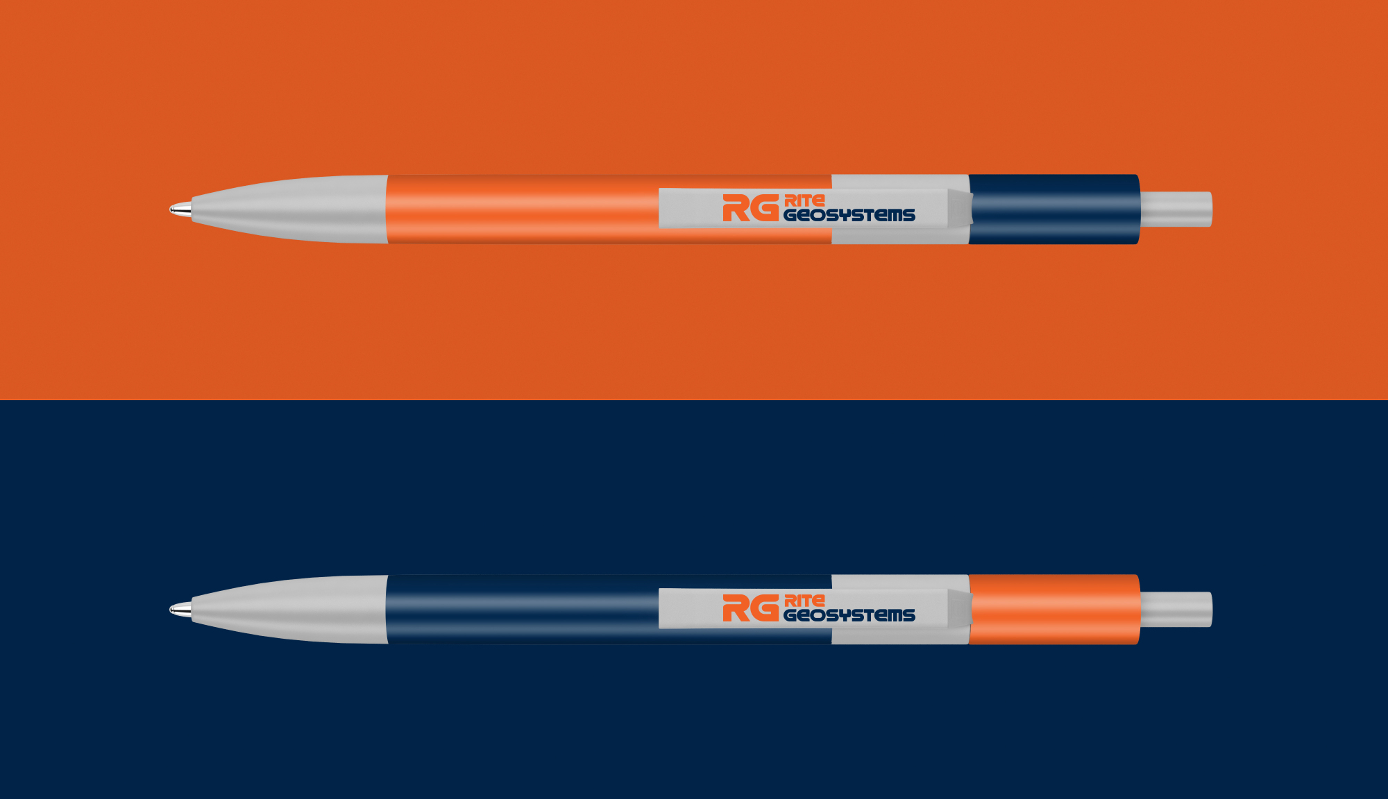
Navy Blue: This shade is seen to be a very positive color. It invokes a sense of trust, security, and responsibility. It also highlights the aspects of being genuine, dependable, and reliable.
Orange: This shade brings a high degree of positivism and compassion, and is always seen to be rejuvenating in the most difficult moments.
Grey: This shade represents neutrality and balance. It is solid and stable, creating a sense of calm and composure, as a relief from a chaotic world.
White: This shade is the color of new beginnings. It opens the way for the creation of anything that the mind can conceive, as it drives ambition.